This screen decides what a guest sees when they land on your direct booking page. Nothing here changes your rates, your availability or your rules: it changes the layout the guest meets them in, and the colours those numbers sit on. Everything you pick is drawn into a preview of your own hotel before you commit it, so you can see the effect on real room names and real prices rather than on a stock mock-up.
How the screen is arranged
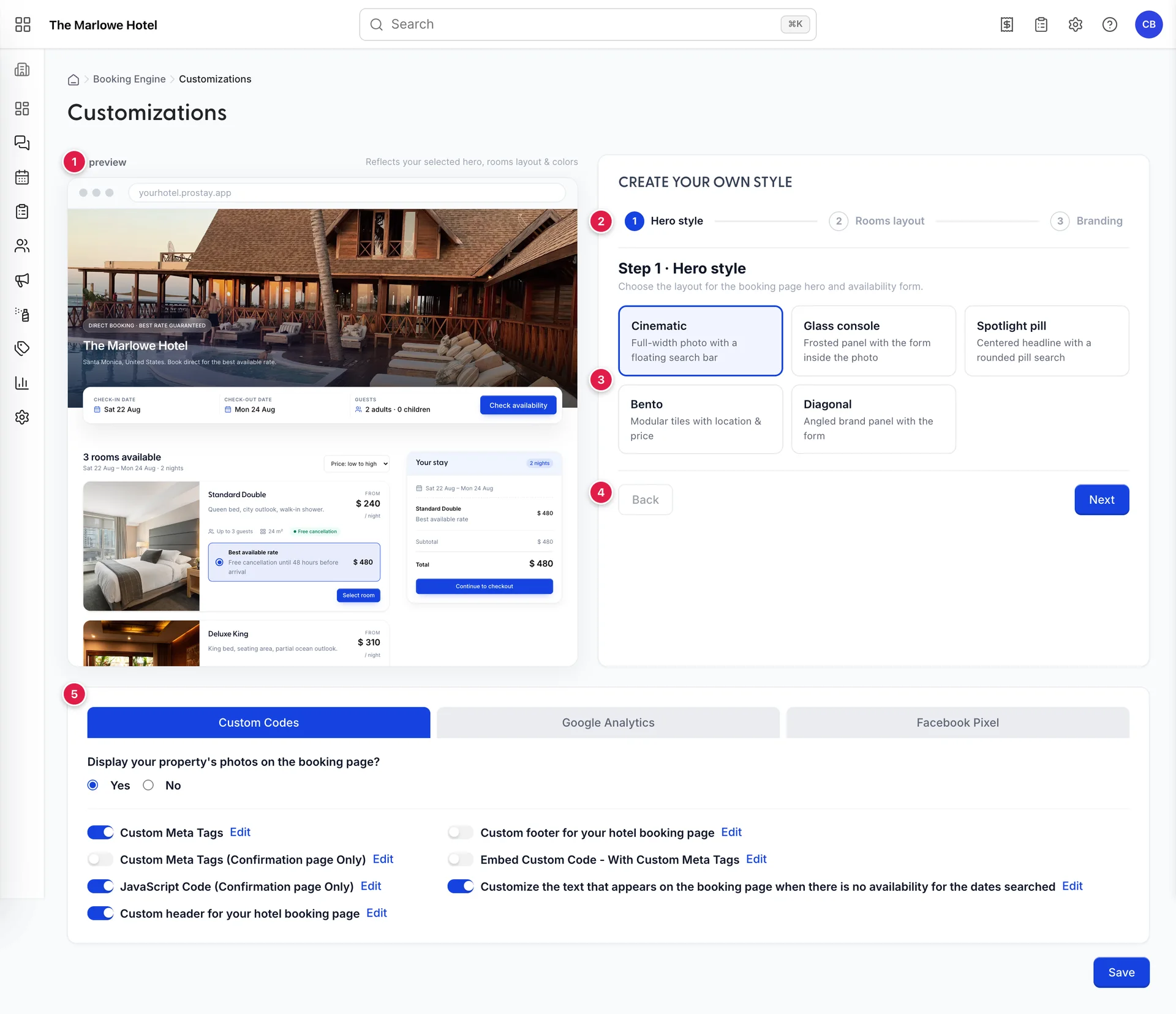
- The live preview. Your booking page as it stands, redrawn on every click. It sticks to the top of the column as you scroll.
- The step rail. Hero style, Rooms layout, Branding. Click any of the three to jump straight to it.
- The step body. The choices for whichever step is open.
- Back and Next. A convenience for working through the three in order. On the last step, Next becomes Save changes.
- The code and tracking card. Custom code, meta tags, Google Analytics and the Facebook pixel. That half of the screen has its own article: injecting your own code and meta tags.
What the preview is actually showing you
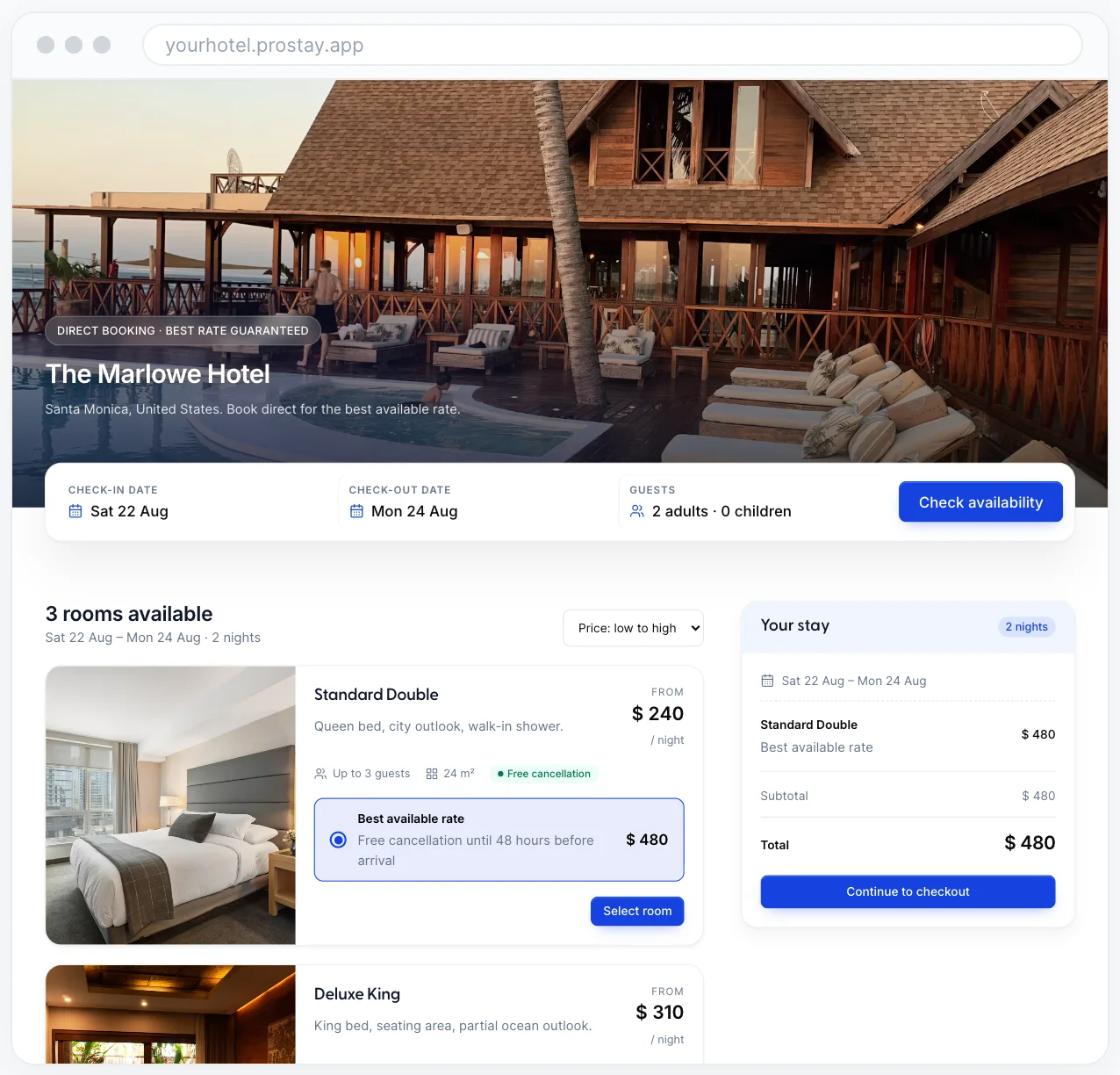
The preview is not a picture of a generic hotel. The hero photograph is your property header, the name and location come from your property record, and the room cards are your accommodation types priced at your own nightly rates in your own currency. That matters more than it sounds: it means you are judging a colour against the actual prices a guest will read, and a room name that is longer than the card can hold will show up here rather than in a guest complaint.
The stay it prices is a sample, not a booking. It picks a two-night stay a week out from today so the dates stay plausible, and it recalculates the total from your rates every time you switch layout. The address bar reads yourhotel.prostay.app as a placeholder; your real booking page lives on the address in your widget settings.
Step 1: the hero

The hero is the top of the booking page: the photograph, your hotel name, and the box a guest types their dates into. The five layouts differ in where they put that box, which is the only part of the hero that earns money.
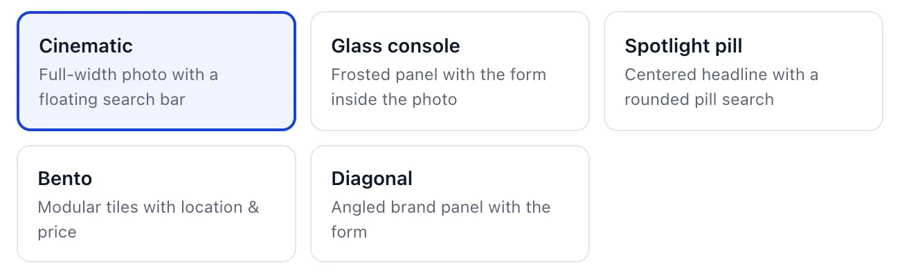
| Hero style | What it does to the page |
|---|---|
| Cinematic | A full-width photograph with the search bar floating across the bottom of it. The safest choice, and the one to keep if your photography is strong and your hotel name is short. |
| Glass console | The search form sits inside the photo on a frosted panel. It puts the dates higher up the page than Cinematic does, at the cost of covering a third of the image. |
| Spotlight pill | A centred headline with the search collapsed into a single rounded pill. The lightest of the five, and the one that gives your headline the most room. |
| Bento | Modular tiles carrying your location and your lowest price alongside the photo. Use it when the price is the argument, because it is the only hero that shows a number before the guest scrolls. |
| Diagonal | An angled panel in your brand colour holding the form beside the photo. The most branded of the five, and the one that depends most on your brand colour being right. |
Step 2: how the rooms are listed
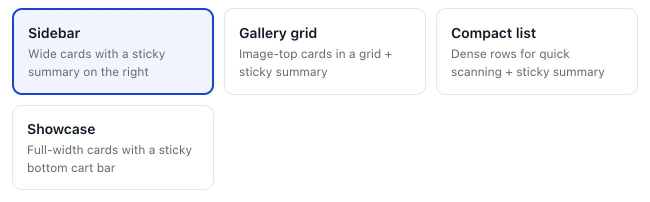
This is the part of the page where a guest chooses, so match it to how many accommodation types you sell rather than to which one looks best empty.
| Rooms layout | What it does to the page |
|---|---|
| Sidebar | Wide cards down the page with the running total pinned to the right. Reads well up to about six types; past that the guest scrolls a long way. |
| Gallery grid | Image-topped cards in a grid, total still on the right. The most photo-led of the four, and the one that suffers most if a type has no photograph. |
| Compact list | Dense rows built for scanning. The right answer for a property with a dozen types, and the wrong one for a boutique with three, because it makes a small inventory look thin. |
| Showcase | Full-width cards with the total moved to a bar across the bottom of the screen. The only layout that frees the full width for the room itself, which is why it suits suites and villas. |
Three of the four keep the summary in a sticky panel on the right and the fourth moves it to a sticky bar at the bottom. Either way the guest can see what they have selected and what it costs without scrolling back, which is the thing that stops a multi-room booking being abandoned halfway.
Step 3: your five colours
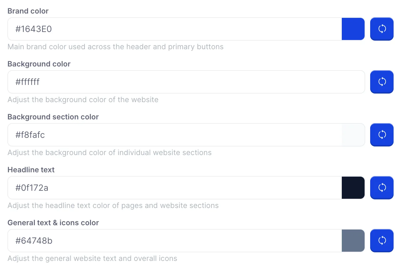
Click a hex field to open a colour picker, or type a hex value straight into it. The square beside each field is the colour you have chosen; the blue button next to that resets the field to the Prostay default, which is not necessarily the value you started the session with.
| Field | What it colours, and the default it resets to |
|---|---|
| Brand color | The header and every primary button, including Check availability and Continue to checkout. This is the one that has to survive white text on top of it. Resets to #1643E0. |
| Background color | The page behind everything else. Resets to #ffffff. Anything much darker than a pale grey will fight the room photographs, which you cannot recolour. |
| Background Section Color | The alternating bands that separate one section of the page from the next, and the fill behind the stay summary. Resets to #F1F4FE. Set it equal to the background colour and the page reads as one long block. |
| Headline text | Section headings and page titles. Resets to #1643E0, so out of the box the headings match the brand colour. Point it at near-black instead if your brand colour is light. |
| General text & icons color | Body copy, field labels and icons. Resets to #606576. This is the field that decides whether a guest can read your cancellation terms, so keep it dark against your background. |
Turning room photos off

This radio sits on the Custom Codes tab in the card below the wizard, which is an odd home for it, because it is a design decision rather than a code one. Set it to No and the room cards drop their images and fall back to text: the room name, the description and the rate. The hero photograph stays either way, because that comes from your property header rather than from your accommodation types.
There is one good reason to turn it off. If your accommodation types have no photographs, or only some of them do, a photo-led layout renders a row of grey rectangles next to the ones that do have images, and a guest reads that as rooms you are hiding. Turning photos off until the gaps are filled looks deliberate; leaving them on does not.
Saving, and what one Save covers
There are two save buttons on this screen and they do the same thing. Save changes at the end of the wizard and Save at the bottom right of the page both write the whole screen: the hero style, the rooms layout, all five colours, the photo radio, every custom code field and the analytics IDs on the other two tabs. You do not need to press both, and pressing one does not leave the other half unsaved.
A successful save shows Successfully updated! and reloads the saved record, so the values you are looking at afterwards are the ones on the server rather than the ones in your browser. That reload is the check worth making: if a save cannot reach the server your changes stay on screen unsaved, and the way to tell the two states apart is that a saved page comes back from the server rather than sitting where you left it.