Demand Forecasting projects your next 30, 60 or 90 days one day at a time: how full you expect to be, what you expect the average room to sell for, and which days are busy enough to be worth protecting. It is a reading screen. There is no field on it you can change and nothing on it writes a rate.
That makes it the screen to open before you go and change something else. A rate change you make on the rate calendar or a boundary you set in Autopilot is a decision about a specific set of dates, and this is where you work out which dates those are.
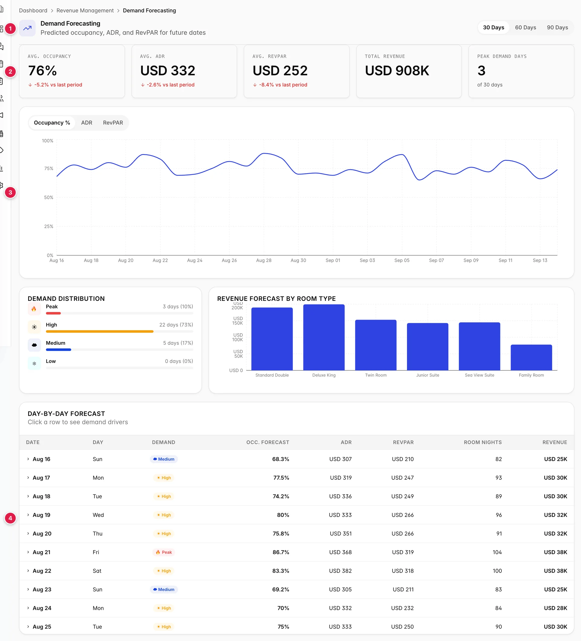
- The horizon control. Everything below it redraws when you change it.
- Five tiles summarising the whole horizon.
- One metric plotted across the period, with three metrics to choose from.
- The day by day table, which is where the detail is.
What the forecast is, and what it is not
The forecast is built from the reservations you already hold, projected forward. It is not a market prediction and it knows nothing about your competitors, the weather or what is on in town. A day shows as quiet because few people have booked it yet, which is not the same as a day nobody wants.
This matters most at the far end of a 90 day horizon, where almost nothing is on the books yet and almost every day will read Low or Medium. That is the booking window, not the demand. The nearer half of any horizon is the half worth acting on.
Choosing how far ahead to look
The 30 Days, 60 Days and 90 Days buttons at the top right set the horizon, and every tile, chart and table row on the screen is recalculated from it. The period always starts tomorrow: today is in progress and a part-finished day would drag the averages down.
The change indicators under the first three tiles compare against the window immediately before the one you are looking at, of the same length. So a 30 day forecast is compared against the previous 30 days, and a 90 day forecast against the previous 90. Switching the horizon therefore changes what you are comparing against as well as what you are looking at, which is why the percentages move when you press a different button. The forecast has not changed; the yardstick has.
The five tiles

| Tile | What it is, and what it is not |
|---|---|
| Avg. Occupancy | The mean of the daily occupancy forecasts across the horizon. Every day counts equally, so one sold-out weekend does not pull it up the way it would pull up a revenue total. |
| Avg. ADR | The mean of the daily average rates. Note that this is an average of averages, not total revenue divided by total room nights, so a busy day and a quiet day weigh the same in it. |
| Avg. RevPAR | Revenue per available room, averaged the same way. It falls when either occupancy or rate falls, which is why it is the tile that moves most. |
| Total Revenue | A sum, not an average: every day's forecast room revenue added together. It scales with the horizon, so it roughly triples between 30 and 90 days and cannot be compared across horizons. |
| Peak Demand Days | How many days in the horizon reached the Peak level, with the horizon length beside it. This is the tile to read first: it is the count of days worth defending. |
A red downward arrow on the first three tiles is not automatically bad. It compares a future window against a past one, and if the past window contained your peak weeks then a fall is the season ending rather than a problem.
The chart, and its three metrics
The chart plots one metric across the whole horizon. Occupancy %, ADR and RevPAR switch which one. The axis relabels itself, so you can tell which metric you are looking at without reading the buttons.
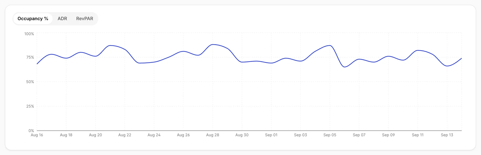
What the chart is good for is shape rather than value. The regular sawtooth in the occupancy line is your week: the peaks are Fridays and Saturdays, the troughs are midweek. A dip that breaks the pattern is worth looking up in the table.
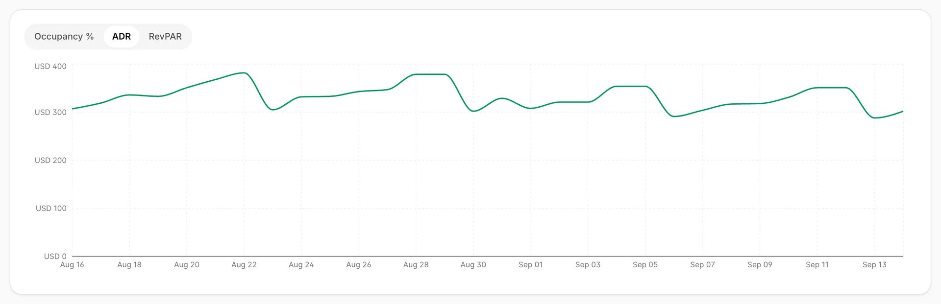
Comparing the occupancy line against the ADR line is the most useful thing on this chart. Where both rise together you are pricing into demand correctly. Where occupancy rises and ADR stays flat, you are filling those days at your ordinary rate and leaving money on the table.
Demand distribution and room type revenue
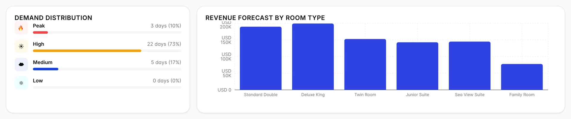
Demand Distribution counts the horizon into four demand levels, with the number of days and the share of the period. It answers a question the chart cannot: not how full you will be on average, but how lumpy the period is. Twenty-two High days and three Peak days is a steady month. Three Peak days and twenty-two Low days is the same average and a completely different problem.
Revenue Forecast By Room Type splits the forecast revenue across your six accommodation types. The bars are driven by how many of each type you have as much as by what they charge, so your largest inventory usually leads even when it is not your most expensive room.
The day by day table
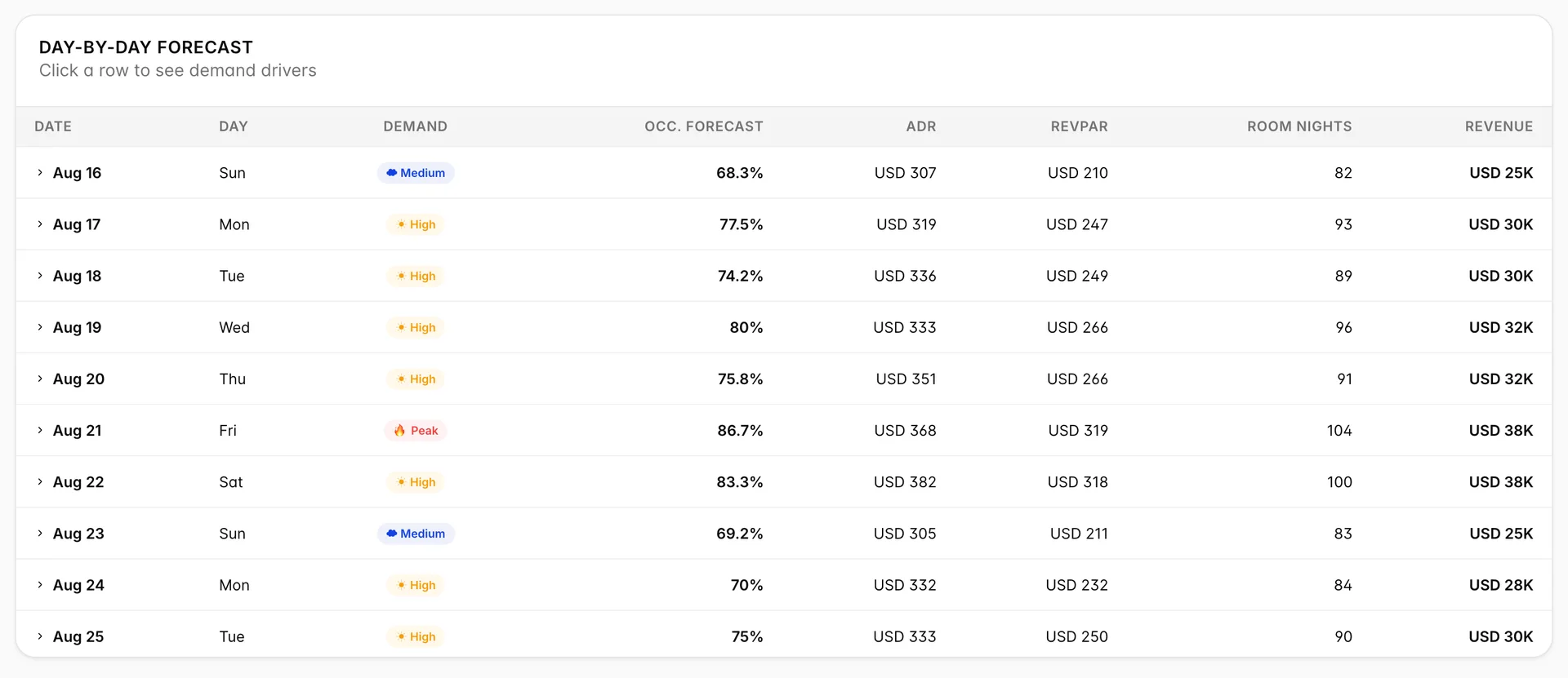
One row per day, and this is where the decisions get made. The demand badge is derived from the occupancy forecast in the very next column, using fixed thresholds:
| Demand level | Forecast occupancy |
|---|---|
| Peak | 85% and above |
| High | 70% to 84.9% |
| Medium | 50% to 69.9% |
| Low | Below 50% |
Because the badge is only ever a restatement of the occupancy column, the two can never disagree. If you find yourself reading both, read the occupancy figure: it tells you how close to a threshold a day is, and a day at 84.8% is a Peak day that has not been rounded up rather than a High day.
Room Nights and Revenue are the same forecast expressed as volume and money. Revenue is rounded to the nearest thousand in the column, so adding the visible figures will not match Total Revenue exactly.
Why a day reads the way it does
Clicking any row expands it and shows the drivers behind that day. Nothing on a closed row indicates this, so it is easy to use the screen for months without finding it.

| Driver | When it appears |
|---|---|
| Peak season | The date falls in July, August or December. |
| Weekend premium | The date is a Friday, Saturday or Sunday. Friday counts because it sells like a weekend night, not because it is one. |
| High demand | Forecast occupancy is above 80%. This overlaps the Peak badge deliberately: a day can be busy without being a Peak day. |
| Holiday period | The date falls in December, so it appears alongside Peak season for that month. |
| Baseline demand | None of the above applied. It means there is no particular reason for this day to be busy, which is itself worth knowing. |
The drivers explain the shape of the forecast rather than producing it. The occupancy figure comes from your bookings; the tags tell you which of the predictable patterns that day sits in. A Peak day carrying only Baseline demand is the interesting case: it is full for a reason the system cannot see, which usually means something is on locally and your rate is too low.
Using the forecast to set rates
The forecast does not change prices. Everything you decide here is carried out on another screen:
- Read Peak Demand Days and the distribution panel to see how many days are worth acting on. If the answer is two, this is a ten minute job rather than a rate strategy.
- Find those days in the table and expand them. A Peak day with no seasonal or weekend driver is the one to look at hardest.
- Raise the rate on individual nights on the rate calendar, which is covered in Overriding a night's rate, and reading pickup and pace.
- For a pattern rather than a handful of nights, set the boundaries and let the engine work, which is covered in Automated pricing with Autopilot.