The Numbers That Actually Matter
I want to start with a number that should bother every operator running a hotel restaurant or independent F&B outlet in 2026: between 3 and 9 cents. That is the National Restaurant Association's 2024 Operations Data Abstract net-margin band for full-service and casual-dining concepts, with the median sitting just over 5 cents on every dollar of revenue. The Foundry Restaurant Velocity benchmark for 2026 sharpens it further: QSR concepts run 6 to 12 percent net margin, fast casual 6 to 10, casual dining 3 to 7, fine dining 5 to 10, and bars 5 to 12. Net margin in restaurants has always been a thin band, but in 2026 the band has structurally narrowed because food cost is sitting more than 35 percent above pre-pandemic levels per the Bureau of Labor Statistics index that the NRA cited in its 2026 outlook, while guest willingness-to-pay has risen by less than half that amount.
The single most controllable variable left in restaurant economics is prime cost: food, beverage, and paper goods cost-of-sales plus all-in labor. Industry guidance from the NRA puts a healthy prime cost at 55 to 60 percent for QSR, 57 to 62 for fast casual, 60 to 65 for casual dining, and 65 to 72 for fine dining and hotel restaurants. Prime cost above 65 percent in any limited-service concept and above 70 percent in any full-service concept is what the Level CFO 2026 benchmark calls structural distress: the band of distance between revenue and the rest of the P&L is so narrow that rent, utilities, marketing, and any kind of owner draw are competing for what is left, and most months something has to lose. The NRA 2024 numbers showed the gap most starkly in full-service: profitable full-service operators ran labor cost at 34.2 percent of sales while loss-making operators ran 42.9 percent, a gap of 8.7 percentage points that is essentially the entire EBITDA story.
Inside that prime cost line, food cost is the variable most operators try to manage with a hammer (negotiate harder with suppliers, switch protein vendors, cut portion sizes by 5 percent and hope no one notices) and the variable that responds best to a scalpel. The scalpel is menu engineering, and a 2014 Cornell University replication that the eCornell Menu Design and Engineering program still cites in 2026 found that restaurants implementing disciplined menu engineering practices saw an average 10 percent increase in profitability without adding a single new item or cover. Foundry's 2026 benchmark of 1,200 independent operators put the contribution-margin lift in a tighter range of 8 to 14 percent annualized for operators running quarterly menu engineering, with the spread driven mostly by how rigorously the quadrant analysis was done and how willing the operator was to actually kill the Dogs.
The thing that makes menu engineering durable is that none of the lift comes from raising base prices or cutting portion costs (those are levers, but separate ones). It comes from changing the mix of what guests order, by changing what is featured on the menu. When you move guests from a Plowhorse with a 7 dollar contribution margin to a Star with a 13 dollar contribution margin, the same average cover at the same average ticket adds 6 dollars of pure margin to your P&L per guest. Across a 90-cover Friday night service, that is 540 dollars of margin from a discipline that costs you nothing in COGS or labor, only the time to run the analysis and update the menu layout. The arithmetic is what keeps the framework alive 44 years after Michael Kasavana and Donald Smith first formalized it at Michigan State University in 1982.
The reason most restaurants do not do this rigorously, despite the math, is twofold. First, the framework is taught at hospitality school using a 2x2 matrix that the operator immediately tries to apply to the entire menu at once, which produces useless quadrants where all the steaks are Stars and all the appetizers are Dogs because the popularity numbers are not comparable across categories. Second, the contribution-margin math requires recipe-level cost accounting that most independents do not maintain in their POS, which means the analysis turns into a one-time spreadsheet exercise, the recipe costs go stale within a quarter, and the engineering pass becomes annual instead of quarterly. Both problems are solvable in 2026 with discipline and a POS that exports clean sales-mix data. Most operators have the second; very few have the first. This article is the honest 2026 read on what to actually do.
Why the 1982 Framework Still Works in 2026
Michael Kasavana and Donald Smith published the menu engineering framework in 1982 in the Cornell Hotel and Restaurant Administration Quarterly. The framework is older than the fax machine, older than the modern POS, older than 95 percent of the operators using it today. Every two years a hospitality consultant publishes a piece arguing that menu engineering is dead because Instagram, ghost kitchens, dynamic pricing, AI menu boards, or generational shift in dining preferences have rendered the math obsolete. The math does not care. The framework keeps producing 8 to 14 percent contribution-margin lift for operators who run it properly because the underlying cognitive constraints on the guest have not changed: the guest spends roughly 1 minute and 30 seconds reading the menu per Cornell eye-tracking research updated through 2024, the guest reads roughly 7 to 9 items in detail before choosing, and the guest's choice is heavily anchored by what they see first.
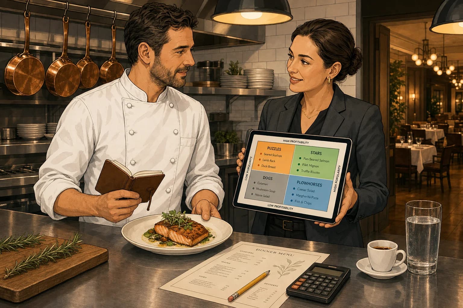
The 2x2 matrix classifies every item using two variables that any POS can produce. Contribution margin (CM) is the dollar profit per item, calculated as menu price minus ingredient cost: a 14.95 dollar chicken sandwich with 4.18 dollars of ingredient cost has a contribution margin of 10.77 dollars. Popularity is the item's share of total category orders over a defined window, typically 30 to 90 days. The 2x2 splits each item by whether it is above or below the category average on each axis, which produces four quadrants:
- Stars (high CM, high popularity): the items printing money. Protect them, feature them in the layout, never bury them on page three. The textbook target is 35 to 45 percent of orders in this quadrant.
- Plowhorses (low CM, high popularity): the items the guest loves but that do not love your margins. They drive traffic but eat the profit per cover. Reprice slightly, reformulate, or pair with a high-margin add-on.
- Puzzles (high CM, low popularity): the items the guest is not finding. Almost always a placement or description problem rather than a food problem. Reposition, rewrite the description, train the staff to recommend.
- Dogs (low CM, low popularity): the dead weight. They cost prep time, plate cost, menu real estate, and buying-attention. Killing them is the single biggest move in most engineering passes.
The action items are deliberately blunt because the framework is designed to be operator-runnable. You do not need a statistics degree, you need a POS export, a recipe cost sheet, and the discipline to actually act on the quadrant assignments instead of debating them in committee. The disagreements that I see in 2026 are almost never about whether a dish is a Star or a Dog (the data is clear on that), they are about whether the operator has the political will inside the kitchen to remove a Dog that the chef is emotionally attached to. The framework cannot solve that for you, but the framework will tell you exactly what each Dog is costing you per week so the conversation has a number behind it.
The Right Numbers to Track (and the Wrong Ones)
The most common error in 2026 menu engineering, larger than the whole-menu-versus-by-category mistake, is using food cost percentage as the profitability axis instead of contribution margin in dollars. The two metrics tell different stories and the difference matters. A 9 dollar appetizer at 28 percent food cost has a CM of 6.48 dollars. A 24 dollar entree at 35 percent food cost has a CM of 15.60 dollars. The food cost percentage tells you the entree is "less efficient" by 7 percentage points, which is technically true and operationally useless. The CM in dollars tells you the entree pays for 2.4 times the rent per ticket, which is what your P&L actually cares about.
Operators who plot menu engineering quadrants on food cost percentage end up with a chart that flatters the cheap appetizer salad (low food cost percentage so plotted as "high profitability") and punishes the steak (high food cost percentage so plotted as "low profitability"), which inverts the actual P&L impact. The Foundry 2026 benchmark of operators running quadrant analysis correctly versus incorrectly found that operators using CM in dollars produced 9 to 14 percent annualized contribution-margin lift; operators using food cost percentage produced 2 to 4 percent, with much of that gain accidental rather than earned. Use CM in dollars. Track food cost percentage separately for purchasing, inventory, and pricing-discipline conversations, but do not let it into the engineering quadrant.
The popularity axis is more straightforward but still has two common pitfalls. First, menu mix percentage by category is the right metric, calculated as item orders divided by total category orders over a defined window. Total-menu mix percentage is structurally biased toward high-volume categories (entrees) and against lower-volume categories (desserts), which produces the all-steaks-are-Stars problem. Second, the window matters: 30 days is too short for most independents because seasonal noise and special events distort the baseline; 90 days is the sweet spot for stable concepts; 180 days is appropriate when you have just changed the menu and want a clean read on the new layout's performance. Do not extend past 180 days because food cost will have shifted enough by then that the CM axis goes stale.
The third number that matters, often overlooked, is the category contribution share: the dollar contribution margin generated by each menu category as a percentage of total contribution margin. In a typical full-service restaurant, mains generate 50 to 60 percent of total CM, beverages 20 to 25 percent, appetizers 10 to 15 percent, desserts 5 to 10 percent. If your beverage share is below 18 percent, the highest-leverage menu engineering work is on the wine and cocktail list, not on the food menu. If your dessert share is below 5 percent, you are either underpricing or your servers are not selling them; both are fixable. Run the category contribution share before you run the per-item quadrants because it tells you where to point your attention first.
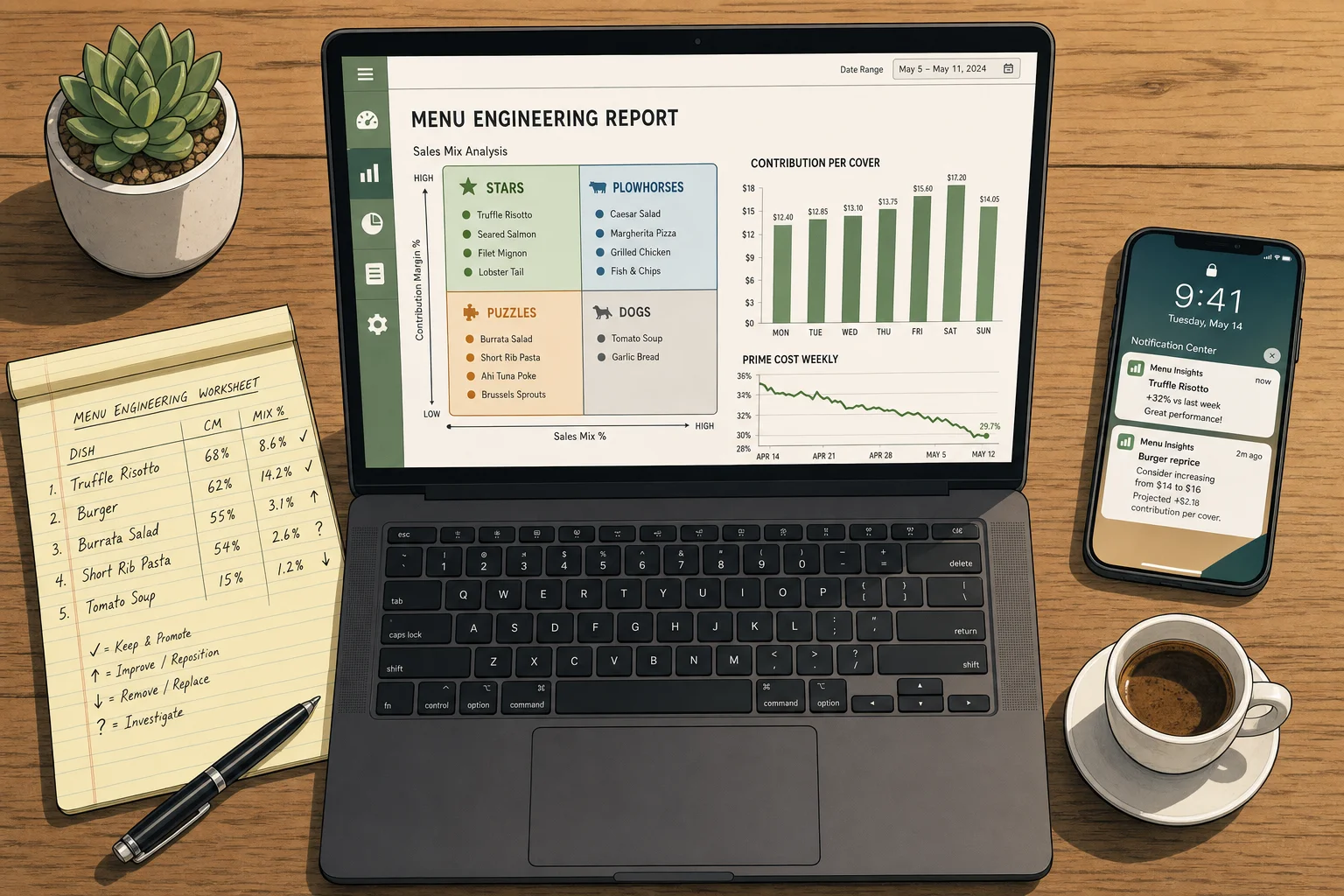
Finally, the menu engineering report that any modern POS should produce on demand needs five columns per item: menu price, ingredient cost (from a current recipe sheet, not a guess), contribution margin (auto-calculated), units sold over the chosen window, and category mix percentage (auto-calculated). If your POS cannot produce these five columns for every item by category in under five minutes, the POS is the constraint and the menu engineering work cannot be sustained quarterly. Cloud-based POS platforms with sales-mix reporting (Toast, Lightspeed, Square for Restaurants, Tableview, Aloha) all have this functionality in 2026; legacy on-premise POS systems often do not, which is one of several quiet operational reasons most independents are migrating to cloud POS.
The Four Quadrants with Real Numbers
The matrix is most useful when you stop reading it as theory and start reading it as a sample P&L for a single category. Below is the quadrant analysis for a 10-item dinner main menu at a typical 80-seat casual-dining restaurant doing approximately 220 dinner covers per night and roughly 6,600 covers over a 30-day window. The numbers are rounded but representative of the spread you should expect to see when you pull your own POS export.
Mains category, 30-day window, 6,600 total covers, average mains menu mix of 10 percent per item:
- Ribeye Steak — 38 dollars price, 14 dollars food cost, 24 dollars CM, 720 units (10.9 percent), Star. The single highest absolute contribution generator: 24 dollars * 720 = 17,280 dollars of CM in 30 days from this one item, more than 18 percent of total mains CM. Protect.
- Pan-Seared Salmon — 26 dollars price, 9 dollars food cost, 17 dollars CM, 580 units (8.8 percent), Star. Second-largest absolute contribution: 9,860 dollars in 30 days. Protect, feature.
- Grilled Chicken — 22 dollars price, 6.50 dollars food cost, 15.50 dollars CM, 510 units (7.7 percent), Star. Below-popularity median but above-CM median, so technically a Puzzle in the strict 2x2 split, but on a category basis the volume is high enough to treat as a Star. Feature alongside the Salmon.
- Classic Burger — 14 dollars price, 6 dollars food cost, 8 dollars CM, 1,090 units (16.5 percent), Plowhorse. The biggest popularity item by a wide margin and the worst contribution per unit: 8,720 dollars of CM in 30 days, which sounds large until you compare it to the Salmon at 9,860 from 510 units. The Burger is the structural drag on category margin. Reprice from 14 to 16 dollars (a 14 percent price increase on a market-checked anchor item, which is at the upper end of what casual-dining will accept without volume loss in 2026): assuming 8 percent volume loss, you keep 1,003 units * 10 dollars CM = 10,030 dollars, a 1,310 dollar net margin gain per month. Or reformulate: drop a 1.50-dollar topping, hold the price at 14, and add 1,090 * 1.50 = 1,635 dollars of monthly CM with no volume risk. Both work. Doing nothing leaves money on the floor.
- Fish and Chips — 18 dollars price, 7 dollars food cost, 11 dollars CM, 740 units (11.2 percent), Plowhorse. Second-highest popularity, mid-range CM. Reprice to 19 with the menu redesign and add a curry-mayo dip variation as a 2-dollar add-on; Foundry benchmark says category-mix add-on attach at 18 to 25 percent on a well-positioned modifier. Adding 22 percent attach * 740 units * 2 dollars = 326 dollars per month, plus 740 dollars from the price uplift, equals 1,066 dollars net.
- Caesar Salad with Chicken — 16 dollars price, 4.50 dollars food cost, 11.50 dollars CM, 480 units (7.3 percent), Plowhorse. Solid CM but low for a chicken protein on the mains menu. Likely a guest defaulting to a "lighter" choice. Move to a separate Light Mains or Salads sub-section in the redesign so it stops competing with the Burger and Fish and Chips for the lighter-meal occasion; in Foundry data, this kind of category-split alone tends to lift the salad's mix share by 15 to 25 percent because guests find it without scanning past three full-fat options.
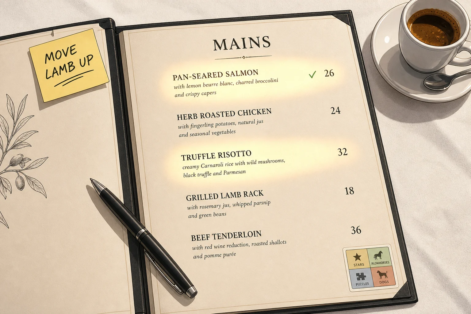
- Truffle Risotto — 32 dollars price, 8 dollars food cost, 24 dollars CM, 220 units (3.3 percent), Puzzle. High CM, low popularity. The most common cause is layout: the dish is sitting on page two of the menu alongside other low-volume mains. Move it into the Golden Triangle (top-right or center-top) of the mains page, add a descriptive sensory line ("Slow-stirred Carnaroli risotto with shaved Périgord truffle and aged Parmigiano-Reggiano"), and Foundry benchmark predicts a 20 to 35 percent volume lift over 30 days. From 220 units to 285 units adds 65 * 24 = 1,560 dollars of CM per month with no menu-cost change.
- Lamb Rack — 36 dollars price, 13 dollars food cost, 23 dollars CM, 165 units (2.5 percent), Puzzle. Same diagnosis as the Risotto: the description and placement are losing it. The Wansink Cornell descriptive-label finding (27 percent lift on labeled items) applies most strongly to dishes with provenance ("Devon-raised lamb rack, fresh thyme jus") and the placement work on the menu's right-edge flush column tends to add another 10 to 15 percent. A combined intervention typically lifts Puzzle mains 25 to 40 percent in 30 days.
- Vegetarian Pasta — 16 dollars price, 6.50 dollars food cost, 9.50 dollars CM, 195 units (3.0 percent), Dog. Borderline Dog, low on both axes. Either elevate to a Puzzle (rename, reposition, add a seasonal vegetable variation that supports a price uplift to 18) or remove. The honest 2026 question is whether you have a dietary-accommodation reason to keep it (parties of 4 or more often need at least one solid vegetarian option to convert the booking), and if you do, accept that this item is structurally a margin loss and move on. Mark it green on the menu so it is easy to find but do not feature it.
- Seared Scallops — 28 dollars price, 11 dollars food cost, 17 dollars CM, 100 units (1.5 percent), Dog. Genuinely a Dog. Low popularity, mid-range CM, in a category where Salmon and Risotto already capture the seafood demand. Kill. The 100 units represent prep complexity, expensive inventory holding, and 17 * 100 = 1,700 dollars of monthly CM that you almost certainly recapture by moving those 100 covers to the Salmon (which gains 100 * 17 = 1,700 dollars) or the Truffle Risotto (which gains 100 * 24 = 2,400 dollars). The kill is margin-positive in either substitution scenario.
The category-level reading: this menu has Stars accounting for 32.4 percent of mains orders, Plowhorses 35.0 percent, Puzzles 5.8 percent, and Dogs 4.5 percent. Star share is below the 35 to 45 percent target, Plowhorse share is in target, Puzzle share is below the 10 to 15 percent target (which suggests two or three Puzzles are being lost to layout problems), and Dog share is in target but with a high enough absolute count to remove. The disciplined engineering pass would reprice the Burger and Fish and Chips, reposition and rewrite the Risotto and Lamb Rack, kill the Scallops and consider killing the Vegetarian Pasta, and feature the Ribeye and Salmon more prominently. Modeled net contribution lift over the next 30 days: roughly 5,800 to 7,200 dollars per month, depending on volume-loss assumptions on the Burger reprice. Annualized: 70,000 to 86,000 dollars of margin. No new staff, no new equipment, no new marketing.
That model is what the framework actually produces when applied with discipline. The number is large enough to fund a junior reservations manager or a quarter of a refurb cycle. The number is also why the framework keeps surviving consultant articles announcing its death.
The Five Mistakes Operators Still Make in 2026
I have run pre-engineering audits for enough independent operators in 2024 and 2025 to claim a pattern, and the pattern is that the same five mistakes show up in nearly every audit, regardless of segment, region, or operator sophistication. They are listed below in roughly the order of damage they cause.
1. Plotting the entire menu as a single quadrant
The most common mistake is the simplest. The operator pulls a 6-month POS export, drops every menu item into one big quadrant chart, and gets a result where every steak is a Star and every appetizer is a Dog because the popularity axis is comparing a 38-dollar entree against a 7-dollar side. The quadrant is technically correct (popularity counts are higher on entrees, contribution dollars are higher on entrees) and operationally useless because no guest is comparing the steak to the side dish in their decision process. The Toast 2025 Voice of the Restaurant Industry Survey put it bluntly: operators who plot whole-menu quadrants identify 40 to 60 percent fewer engineering opportunities than operators who segment by category. Run separate quadrants for Appetizers, Mains, Sides, Desserts, and within Beverages a separate quadrant for Cocktails, Wines by the Glass, Beers, and Non-Alcoholic. The work is more clerical but the action items become useful.
2. Using food cost percentage instead of contribution margin in dollars
The second mistake is the one I covered in detail in the previous section: using food cost percentage as the profitability axis. To reiterate the reason: a 9-dollar appetizer at 28 percent food cost has a CM of 6.48; a 24-dollar entree at 35 percent food cost has a CM of 15.60. The percentage axis flatters the appetizer by 7 points and inverts the actual P&L impact. Track food cost percentage as a separate metric for purchasing and pricing discipline conversations, but do not let it into the menu engineering quadrant. Use CM in dollars. The Foundry 2026 spread between operators using CM in dollars (9 to 14 percent annualized lift) and operators using food cost percentage (2 to 4 percent) is the largest single source of variance in engineering outcomes.
3. Running it once a year instead of quarterly
The third mistake is treating menu engineering as an annual exercise tied to the menu reprint or a major seasonal change. Annual cadence misses two-thirds of the year of food cost drift, ingredient substitutions made by the kitchen for availability reasons, and the gradual creep of low-margin items into popularity as servers default to recommending them. The Foundry benchmark cited above puts annual cadence at 2 to 4 percent annualized lift, which is barely above noise and is mostly accidental. Quarterly cadence (90-day windows, four passes per year) puts the lift at 9 to 14 percent. Monthly cadence is over-corrective for stable menus but appropriate for the month after a menu redesign or a major ingredient cost change of more than 8 percent on a Plowhorse. The quarterly discipline is the right default; deviate to monthly when there is a specific reason.
4. Killing Plowhorses instead of repricing them
The fourth mistake is more emotional than analytical. The operator looks at the Burger generating an 8-dollar contribution margin, sees a steakhouse-style 24-dollar CM on the Ribeye, and decides the Burger is "dragging down the menu." They remove it from the menu in the next reprint and watch what happens. What happens is that 60 to 80 percent of the Burger volume migrates to the next-cheapest similar item (the Fish and Chips), which means the operator just moved a high-popularity Plowhorse off the menu and converted it into volume on a slightly higher-margin Plowhorse, while losing 20 to 40 percent of the Burger volume to "I'll go somewhere else this week" abandonment. The right move on a Plowhorse is almost always to reprice (modest 5 to 12 percent uplift on a market-checked item), reformulate (drop a 1.50 garnish, swap a topping, reduce a sauce portion), or attach (add a 2-dollar modifier with an 18 to 25 percent expected attach rate). Kill a Plowhorse only if a category restructure is replacing it with a deliberate substitute; never kill a high-volume Plowhorse blind. The Foundry data on operator-killed Plowhorses without a substitution plan shows a 6 to 11 percent volume loss to the category as a whole, which is almost always larger than the per-cover margin gain.
5. Believing decoy and dollar-sign tricks alone will fix a Dog
The fifth mistake is the consultant-driven mistake. Someone reads a menu psychology article (or worse, hears it on a podcast), learns that decoy pricing and dollar-sign removal can lift conversion by single-digit percentages, and applies the techniques to the menu's worst-performing items hoping for a turnaround. The techniques work; the problem is that they are second-derivative levers and they do not save fundamentally bad items. The Cornell dollar-sign study found 8.15 percent average-check lift across the whole menu, not on a single item. The decoy effect lifts conversion of the target middle item by 10 to 25 percent in the literature, but the target item must already be reasonable; a decoy-flanked Dog is still a Dog with slightly more company. The honest 2026 read on menu psychology is that the techniques amplify the gain on a well-engineered menu by 15 to 30 percent on top of the contribution-margin lift, which is real but secondary. Run the engineering first; layer the psychology on top once the quadrants are clean. Doing it in the other order is consultant theater.
Pricing Psychology That Has Real Numbers Behind It
Once the engineering quadrants are clean, the second-order lift comes from the small set of pricing-psychology techniques that have real research behind them. There is a much larger set of techniques that get cited in menu-design articles without any data behind them; I am ignoring those. The four below are the ones with replicable studies and measured effect sizes.
The 8.15 percent dollar-sign effect (and its segment limits)
The 2009 Cornell School of Hotel Administration study by Sybil Yang, Sheryl Kimes, and Mauro Sessarego, run with 201 diners at the Culinary Institute of America's St. Andrew's Cafe, remains the cleanest piece of evidence on price-format psychology in restaurants. The researchers ran three menu variants: prices with the dollar sign and decimals ($14.00), prices with the word "dollars" written out ("fourteen dollars"), and prices as plain numerals (14). The plain-numeral version produced an 8.15 percent higher per-person spend than either of the other two variants, with no statistically significant difference between the dollar-sign and written-out-dollars variants. The mechanism the researchers proposed and that the menu-psychology literature has converged on since is the pain of paying: any overt monetary cue (the dollar sign, the word "dollars," the unnecessary decimal) reminds the diner that they are about to part with money, which dampens orders.
The 2024 Goliath Consulting follow-up across 47 upscale-casual restaurants found a 7.2 percent average-check increase from removing both dollar signs and decimals. The OSM Solutions menu-psychology framework that several CPA firms now publish under their own branding extends the finding into a broader set of "invisible price" rules: prices should be inline rather than in a right-flush column with dot leaders (the dot leaders create a visual highway from item name straight to price, making cost the focal destination of the eye); prices should be regular weight rather than bold (bold prices visually emphasize cost); prices should be the same size as the item name or smaller, never larger; the choice between round numbers (14) and charm pricing (13.99) should be deliberate by segment.
The honest 2026 segment fit, which most menu-design articles do not bother to qualify: fine dining and upscale-casual, drop the dollar sign and the decimal because the pain-of-paying signal is the dominant friction. Casual dining, test it both ways for two weeks each on a controlled subset of tables and let your check average decide; the effect is real but the magnitude varies with menu format and concept. Fast casual and quick service, keep the dollar sign and the decimal (and lean into charm pricing at 7.99 instead of 8.00) because price clarity is part of the value proposition and the left-digit bias adds a measured 24 percent or higher conversion lift on individual items per the NetSuite and GoFoodservice 2025 research. Applying the wrong format to the wrong segment costs check average in either direction. The Yang/Kimes/Sessarego finding is segment-specific, not universal.
The 24 percent charm-pricing effect (in the right segments)
The second technique with real data behind it is charm pricing: ending prices in .99 or .95 instead of round numbers. The mechanism is the left-digit bias: consumers mentally process the leftmost digit first, so 13.99 reads as "13 dollars and change" while 14.00 reads as "14 dollars." NetSuite and GoFoodservice 2025 research synthesized across 12 large-chain experiments found charm pricing increases conversion on individual items by 24 percent or more in casual dining and quick-service segments, with the effect concentrated on items priced under 20 dollars (the bias weakens above the 20-dollar threshold because the left digit becomes a two-digit number and the cognitive shortcut breaks down).
The Competera study cited in the 2025 NRA outlook confirmed that consumers mentally round 199 toward 100 rather than toward 200 because of the left-digit anchor. Charm pricing is appropriate for the value-oriented end of the market, where price clarity is a feature; it is structurally inappropriate for fine dining, where round numbers signal premium positioning and where charm pricing actively undermines the concept's perceived value. The MasterClass 2025 menu-pricing guide that several chefs cite frames the binary cleanly: charm pricing in concepts where the guest needs reassurance that the meal is reasonable, round numbers in concepts where the guest needs reassurance that the meal is special. Apply the format that matches the concept, not the format that the article you read last week recommended for a different concept.
The 27 percent descriptive-label effect
The third technique with real research behind it is the descriptive label. Brian Wansink's Cornell research, replicated in multiple field experiments through 2024, found that adding sensory and provenance language to a menu item lifts orders for that item by approximately 27 percent over the same dish presented with a generic name. "Pan-seared salmon" becomes "Hudson Valley salmon, crisped and herb-buttered." "Grilled chicken" becomes "Free-range Cornish hen, lemon and rosemary roasted." "Risotto" becomes "Slow-stirred Carnaroli risotto with shaved Périgord truffle and aged Parmigiano-Reggiano." The same dish, with the provenance and the sensory verb, reads as a different dish, and the post-meal Wansink finding extended further: diners rated the food itself as higher quality after eating, even though the dish was identical, because the descriptive frame primed their experience.
The mechanism is anchoring of perceived value: the descriptive label sets an expectation that the dish is more carefully sourced and more thoughtfully prepared, and the guest brings that expectation to the experience. Two practical caveats. First, the description must be truthful; "Hudson Valley salmon" is a lift if the salmon is actually from the Hudson Valley and a brand-damage event if it is from a Norwegian aquaculture supplier. Second, the description should occupy roughly two lines of menu copy; longer than that and the guest's reading speed makes them skip the item. The lift compounds with the layout work: a Puzzle item moved into the Golden Triangle and given a descriptive label often produces 35 to 50 percent volume lift in 30 days, because the placement gets it found and the description converts the find into an order.
Decoys and price anchoring
The fourth technique is the decoy effect, formally the asymmetric dominance effect. The classic restaurant application: offer two appetizers, an 8-dollar bruschetta and a 14-dollar carpaccio. Add a third option (an 18-dollar smoked-salmon plate) and the carpaccio share rises because diners systematically gravitate toward the middle option in a three-tier set. The mechanism is extremeness aversion: presented with three options, consumers tend to avoid the cheapest (perceived risk of poor quality) and the most expensive (perceived risk of overspending) and choose the middle. The 2024 International Hospitality Review meta-analysis on decoy pricing found target-item conversion lifts of 12 to 28 percent on well-constructed decoy sets, with the effect strongest in the 6-to-30-dollar appetizer and dessert price bands and weakest in the entree bands above 35 dollars where guests are making more deliberate quality-versus-price tradeoffs.
The complementary technique is price anchoring: leading a category with a premium-priced item that resets the diner's internal sense of "reasonable." A wine list that opens with a 95-dollar bottle makes the 65-dollar bottle look comfortably mid-range; a steak section that opens with a 78-dollar tomahawk makes the 38-dollar ribeye look like a value choice. The Cornell anchoring research updated through 2024 found that opening a category with an item priced 30 to 60 percent above the category median lifts the median-priced items' share by 8 to 18 percent, because the anchor calibrates expectations.
Two important honest caveats. First, decoy and anchoring effects compound the gains on a well-engineered menu by perhaps 15 to 30 percent on top of the underlying contribution-margin lift, but they do not produce gains on a poorly engineered menu. Decoys flanking a Dog do not turn the Dog into a Star; they produce a slightly more populated Dog. Second, the techniques degrade with overuse: if the entire menu is a sequence of decoy triplets and anchor leaders, sophisticated diners read the pattern and the trust effect inverts. Use decoys sparingly (one or two per category at most) and anchor strategically (one premium item per category, not three).
Layout: The Golden Triangle (with the Eye-Tracking Caveat)
Menu engineering and menu psychology converge on the layout question, and the layout question is where the 2026 evidence is most contested. The traditional answer, repeated in nearly every menu-design article since the early 1980s, is the Golden Triangle: the diner's eye lands first on the center of the menu, then moves to the top-right corner, then to the top-left corner, and these three zones are the highest-attention real estate on the page. The advice is to feature your highest-margin items (Stars and re-engineered Puzzles) in the Golden Triangle and bury your Plowhorses and Dogs in the lower-left and lower-right zones.
The 2024 Sage Eye-Tracking in Menus research published in Cornell Hospitality Quarterly partially complicates this. The headline finding: diners' visual attention is more strongly correlated with their pre-existing willingness-to-pay than with the menu's geometric structure. High-willingness-to-pay diners read more of the menu and dwell longer on prices; low-willingness-to-pay diners read fewer items and dwell longer on dish names. The Golden Triangle effect exists but it is weaker than the menu-design literature suggests, with the strongest variant being a top-of-page-then-down-each-column reading pattern in two-column menu layouts, rather than a clean center-top-right-top-left triangle. The 2024 Francis Academic Press study on emotional versus factual descriptions added a second nuance: diners spend longer on factual descriptions for main courses (the dish-name-then-ingredients pattern) and longer on emotional descriptions for appetizers and beverages (the sensory pattern). The right copy register depends on category, not just on placement.
The honest 2026 read on layout, taking the eye-tracking limitations into account: the geometric Golden Triangle is approximately right but not as deterministic as the 1980s literature claims. A Star in the top-right will outperform a Star in the bottom-left by roughly 10 to 18 percent rather than the 30 to 50 percent some menu-design articles still claim. A Puzzle moved into a Golden Triangle position will see 8 to 15 percent volume lift on the placement alone, which compounds with descriptive-label lift to produce the 25 to 40 percent total lift cited earlier. Operate on the placement evidence as a 10 to 18 percent lever, not a 50 percent lever. Combined with descriptive labels, charm-pricing or numeral-only formatting, and decoy and anchor structure, the layered psychology layer produces compound effects, but each individual effect is in the single to low-double digits.
One layout intervention with stronger and more consistent evidence: boxes and visual highlighting. The practice of putting a thin line border or a pale-tint background around two or three of the highest-margin items per category lifts those items' mix share by 12 to 20 percent across the Hotelschamp 2025 hospitality experiment library. The reason is straightforward: the box breaks the regular reading pattern and forces a fixation. The risk is overuse: more than three highlighted items per category and the highlighting becomes background noise. Use it on Stars and on re-engineered Puzzles, never on Plowhorses (because their popularity is already healthy), never on Dogs (because amplifying a bad item is amplifying a bad item).
The 30-Day Re-Engineering Plan
The plan below assumes you have a single operations lead (general manager, F&B director, or owner-operator) running point, a head chef or kitchen manager who can validate recipe costs, a POS system that exports sales-mix data by item over a 90-day window, and roughly 25 to 40 hours of focused time over four weeks. There is no agency engagement and no consulting fee. The plan produces a redesigned menu ready to print on Day 30 and a reviewable contribution-margin lift visible in the POS within 30 days of the new menu going live.
Days 1 to 7: Export and sanitize the data
Day 1 is the POS export. Pull a sales-mix report covering the last 90 days, broken down by item, with units sold, gross revenue, and (if your POS supports it) the per-item food cost from the recipe table. Toast, Lightspeed, Square for Restaurants, Tableview, Aloha, and Lavu all support this export natively in 2026; if your POS does not, the workaround is a sales-mix-by-item export plus a manual recipe cost sheet, which adds 4 to 8 hours of work but does not block the engineering pass.
Days 2 and 3 are recipe cost validation. Walk through the kitchen with the head chef and the latest invoice from each major supplier. For every item in the export, calculate the current ingredient cost using current invoice prices, current portion sizes, and a 4 to 6 percent kitchen waste/yield allowance. The 2026 BLS-tracked food inflation has shifted ingredient costs enough since most operators last touched their recipe sheets that nearly every item will have a different cost than the POS thinks it does. Do not skip this step. A menu engineering pass with a stale recipe sheet is a menu engineering pass with the wrong contribution margins, which produces wrong quadrant assignments, which produces wrong action items.
Days 4 and 5 are category segmentation. Split the export into separate files for Appetizers, Mains, Sides, Desserts, Cocktails, Wines by the Glass, Beers, Non-Alcoholic. If you have sub-categories worth tracking (for example, Salads as a sub-category of either Appetizers or Light Mains depending on your concept), split those out as separate analysis files. Each category should have between 6 and 14 items; categories with fewer than 6 are too sparse for quadrant analysis, categories with more than 14 are typically already over-extended and should be considered for trimming on a separate basis.
Days 6 and 7 are spreadsheet calculation. For each category, calculate the average contribution margin (mean of CM across all items in the category) and the average popularity (mean of menu mix percentage across all items in the category). Plot each item against these two means: items above both means are Stars, above CM mean and below popularity mean are Puzzles, below CM mean and above popularity mean are Plowhorses, below both are Dogs. By the end of Day 7 you have a quadrant assignment for every item on the menu and you have not yet made a single decision; that is correct. The decisions come later, after the diagnosis is complete.
Days 8 to 14: Diagnose and plan
Day 8 is the category contribution share calculation. For each category, sum the total contribution generated (CM * units sold) and express each category's contribution as a percentage of total menu contribution. This tells you where the highest-leverage engineering work sits. If beverages generate 12 percent of total CM in a concept where they should generate 20 to 25, the wine and cocktail list is the priority for the engineering pass; if mains generate 75 percent of total CM (above the 50 to 60 typical), you are over-reliant on mains and the appetizer and dessert categories deserve attention to broaden the contribution base.
Days 9 to 11 are item-level action planning. For each item, document the quadrant, the recommended action (Protect, Reprice, Reformulate, Reposition, Rewrite, Kill), the modeled contribution impact (in dollars per month, using the lift ranges from this article as guides), and any cross-category dependencies (for example, if you kill the Vegetarian Pasta you may need to add a vegetarian option elsewhere). Use the worksheet below as a template:
- Item: dish name as listed on current menu
- Category: category for engineering purposes
- Price (current): current menu price
- Food cost: current per-portion food cost from validated recipe sheet
- CM (current): price minus food cost
- Units (90-day): units sold over the 90-day window
- Mix percent: units / total category units
- Quadrant: Star, Plowhorse, Puzzle, or Dog
- Action: Protect, Reprice (and target price), Reformulate (and change), Reposition (and target placement), Rewrite (and target description), Kill
- Modeled monthly CM impact: dollars per month projected impact of the action
- Notes: cross-category dependencies, supplier constraints, dietary considerations
Day 12 is the cross-category review. The kitchen and the front-of-house lead together review the action list and surface practical constraints: which Plowhorse reformulations require new staff training, which Dog kills create gaps that need filling for booking conversion (parties of 4+ often need at least one solid vegetarian and one gluten-free option), which Puzzles' descriptions need a new photo for the menu reprint, which Stars' protection requires inventory commitments. The review usually produces 3 to 5 amendments to the action list and one or two reversals (the Dog you were planning to kill turns out to be the only option for one specific dietary need; you keep it but reprice it from a Dog into a higher-margin defensive item). Document the amendments with the reasons.
Days 13 and 14 are the menu redesign brief. Translate the per-item actions into a layout brief for the new menu: which items go into the Golden Triangle, which Plowhorses stay in their current placement with new pricing, which Puzzles get their new description, which Dogs get cut, where the new category dividers go if you are restructuring (for example, splitting Mains into Mains and Light Mains). Decide on the price-format conventions for the segment (numerals only for fine-dining and upscale-casual, charm pricing for casual and below). Decide on the descriptive-label register for each category (factual for mains, emotional for appetizers and beverages per the eye-tracking findings). The brief is what your menu designer or in-house design owner will work from in the next phase.
Days 15 to 21: Redesign and price-cost the new menu
Days 15 to 17 are the layout draft. The designer produces a first-pass layout following the brief: Golden Triangle placements, descriptive copy lengths, price typography, category dividers, any boxes or tints for highlighting. The first draft will not be right; the second draft after operator review usually is. Feed the descriptive copy through the head chef for accuracy, especially on provenance claims (do not put "Hudson Valley salmon" on the menu unless the salmon is actually from the Hudson Valley; the brand-damage risk on a guest who notices is larger than the lift).
Days 18 to 20 are the new-price audit. For every item that has a price change in the new menu, check the price against three local competitors' equivalent items as of this week. The 2026 NRA outlook noted that consumer price sensitivity has risen with the cumulative inflation since 2021, and a competitor-blind reprice can cost volume even on a Star. Where the new price is more than 8 percent above the local competitor median for an equivalent dish, reduce the price uplift or hold the current price and find the contribution gain through reformulation instead. Do this audit on the items where you actually changed the price, not on every item.
Day 21 is the modeled-contribution rollup. With the final new-menu prices, recalculate the modeled monthly contribution at the assumed volume mix (using the action-list lift assumptions). A clean engineering pass on a typical 80-to-120 cover casual-dining concept produces a modeled lift of 4,000 to 9,000 dollars of monthly contribution in the first 30 days after the new menu goes live, with the lift growing modestly as the layout effect compounds and as servers learn the new descriptions. Annualized, this is 50,000 to 110,000 dollars of additional contribution. Smaller QSR or fast-casual concepts produce proportionally smaller absolute numbers but similar percentage lifts.
Days 22 to 30: Launch and measure
Day 22 is the staff briefing. The new menu is shared with the entire FOH team in a single 60- to 90-minute session. Each rewritten dish description is read aloud, the rationale for each Dog kill is explained, the new pricing rationale on Plowhorses is explained, and the staff is given a short script for handling any guest pushback on a price increase or a removed item ("We refreshed the menu this season; the salmon is now sourced from..." rather than "We took it off because it didn't sell"). The training matters: a new menu rolled out cold without staff buy-in produces 30 to 50 percent of the modeled lift; a new menu rolled out with disciplined staff briefing produces 80 to 100 percent.
Day 23 is the soft launch. Run the new menu at lunch service only, with the operator present in the dining room to observe guest reactions and capture friction points (a description that does not read well, a price that is generating pushback, a removed item that more guests are asking about than expected). Adjust the second-pass design based on the friction.
Days 24 to 30 are the full launch and measurement. The new menu runs at all services. The POS sales-mix report is pulled at the end of Day 30 (or Day 7 if you want an early read) and compared against the modeled targets. The operator produces a one-page summary: actual versus modeled contribution lift, items performing above expectation (which can be features for the next quarterly pass), items performing below expectation (which need investigation: bad description, bad placement, bad price, or a real demand problem), category mix shifts (which inform the next quarter's category contribution share). This summary becomes the input to the next quarterly engineering pass 60 to 90 days later.
The KPIs to Track (Tier 1 vs Tier 2)
A clean separation between Tier 1 (business outcome) and Tier 2 (engineering mechanism) metrics is the management discipline that makes menu engineering a recurring program rather than a one-time exercise. Tier 1 metrics are reported monthly to the operator, the chef, and the owner. Tier 2 metrics drive the quarterly engineering pass. A Tier 2 win is meaningless until it produces a Tier 1 movement.
Tier 1 metrics (the business outcome):
- Prime cost as a percentage of total revenue. Target: at the segment-appropriate band per the NRA 2024 medians (55 to 60 for QSR, 57 to 62 for fast casual, 60 to 65 for casual dining, 65 to 72 for fine dining and hotel restaurants). Above 65 in any limited-service concept and above 70 in any full-service concept is structural distress. Track weekly, not monthly; the rolling 4-week average is what catches drift before it ossifies.
- Contribution per cover. Total contribution margin generated divided by total covers served. The single cleanest measure of menu engineering progress. A 6-dollar contribution-per-cover lift over 90 days at 200 covers per night is 36,000 dollars of additional monthly contribution, which is the same scale as the modeled lift from a clean engineering pass.
- Revenue mix by category. Mains, beverages, appetizers, desserts as percentages of total revenue. Track quarterly. Drift in mix is the leading indicator of a menu that has stopped working: when beverage share drops from 23 percent to 19 percent quarter over quarter, the cocktail list needs an engineering pass before the food menu does.
- Net margin. The trailing P&L outcome. A clean engineering pass should add 1 to 3 percentage points of net margin over four quarters; a multi-pass discipline over 18 to 24 months should add 3 to 6 points cumulatively, often the difference between a struggling concept and a profitable one.
Tier 2 metrics (the engineering mechanism):
- Star, Plowhorse, Puzzle, Dog mix percentages by category. Track quarterly. Targets: 35 to 45 percent Stars, 25 to 35 percent Plowhorses, 10 to 15 percent Puzzles, under 5 percent Dogs.
- Top 10 contribution-generating SKUs. The items producing the largest absolute monthly contribution. Track quarterly. Stability in this list is healthy; rapid turnover in the top 10 is a sign of menu instability or external demand shock and warrants investigation.
- Dog count and total Dog contribution loss. The number of items currently classified as Dogs and the total monthly contribution they consume in prep time, plate cost, and inventory holding. Track quarterly. A clean engineering program drives this toward zero.
- Items repriced in the last 12 months. The number and percentage of menu items that have had a price change in the last year. Below 25 percent is a sign of pricing inertia (food cost has shifted enough that 25 percent of the menu should have moved on price annually); above 60 percent is a sign of pricing volatility that may erode guest trust.
- Food cost percentage by category. The complement to contribution margin in dollars; tracked separately for purchasing-discipline conversations. Drift above the recipe-based target by more than 2 points for two consecutive months triggers a category-level investigation.
- Cover-weighted contribution per labor hour. The contribution margin generated per labor hour worked, weighted by covers. The cleanest cross-cut between menu engineering and labor productivity. Move the menu mix toward higher CM and the cover-weighted contribution per labor hour rises mechanically; this is where menu engineering compounds with labor scheduling.
The honest sequence is: Tier 2 work feeds Tier 1 outcomes, which feed Tier 2 prioritization. Anything else is theater.
Where Tableview and Prostay Fit, Briefly and Honestly
Prostay is a property management system and booking engine for independent hotels. Tableview is the Prostay group's restaurant POS, designed for hotel F&B outlets and standalone restaurants of the size that this article addresses. I write for the Prostay group, so this section is inevitable, but I will keep it brief and honest.
From the menu engineering perspective covered in this article, the relevant Tableview capabilities are: per-item recipe costing tied to current supplier invoices, so the contribution margin in the sales-mix report reflects this week's prices rather than last year's; category-level sales mix exports as a default report rather than a custom configuration, so the quadrant analysis can be run without a spreadsheet workaround; built-in menu engineering quadrant visualization that classifies every item as Star, Plowhorse, Puzzle, or Dog automatically and updates daily; contribution per cover and contribution per labor hour as standard KPIs in the operator dashboard, not as bespoke calculations; and direct integration with the Prostay PMS so that hotel restaurant guest data (room number, length of stay, loyalty tier) flows into the F&B sales mix and lets you analyze contribution margin by guest segment, which is information that standalone POS systems do not produce.
None of these capabilities is unique to Tableview. Toast, Lightspeed Restaurant, Square for Restaurants, Aloha, Lavu, MarketMan, and several other modern restaurant POS platforms all support the core menu engineering reporting in 2026; some of them go further on specific axes (Toast's app marketplace is broader, MarketMan's inventory layer is more sophisticated for back-office operators). The structural argument for Tableview specifically is the same one I would make for any tightly integrated single-vendor stack: when your hotel PMS, channel manager, booking engine, restaurant POS, and payments share a single audit boundary and a single guest data store, the analysis pipeline shows you contribution margin by booking source, which is the cross-cut that lets you decide whether the F&B program is profitable on direct-booked guests, on OTA-booked guests, or on walk-in trade, and whether the time-of-day mix differs by guest segment in ways that should change the menu's daypart structure.
If you want to see how Tableview handles the menu engineering patterns described in this article, the restaurant POS and hotel management system product pages cover the workflow step by step. If you are running the 30-day plan above and want help configuring the sales-mix exports and the quadrant visualization with the implementation team, book a demo and we will walk through the setup without trying to sell you a separate menu engineering consulting service.
Frequently Asked Questions
The five questions hotel and independent restaurant operators ask me most often about menu engineering in 2026, answered with current numbers and real tradeoffs rather than generic reassurance.